Routed
An AI based travel management service to improve the travel experience of Indian corporate travelers
In today's digital era, business travel remains crucial for companies worldwide, facilitating essential meetings and global exploration. To meet the diverse needs of employees, there's a growing demand for a comprehensive travel management system, especially in India where traditional customs emphasize tactile expressions. Despite virtual alternatives, there's an increasing awareness of the unique benefits of physical travel post-COVID. As corporate travelers seek tailored solutions, the need for adaptable and user-centric travel management becomes paramount. Prioritizing seamless integration and user experience is essential in crafting effective travel solutions for modern enterprises.
Team: Individual project
Duration: 8 weeks
Role/contribution: Design & product strategy, UI-UX , Marketing strategy, Business pitch
Noise
Optimizing Noise's Platform Efficiency: Redesigning the Shopping Bag Experience
Project Type
Noise project
Duration
2 weeks
Role
Product strategy


In the competitive landscape of e-commerce, the cart page plays a critical role in the overall shopping experience. For Noise, a brand renowned for its innovative, stylish and affordable audio and wearable technology products, the importance of a seamless and efficient bag is very important.
The shopping cart or bag page is not merely a transition. point but a decisive moment where potential customers either commit a purchase or abandon their shopping all together.
This project aims to redesign the product bag page for Noise, enhancing the shopping experience and aligning it with Brand's commitment to quality and user satisfaction. By addressing existing issues and optimising the product bag page, the goal is to boost conversion rates, reduce cart abandonment and ensure a consistent and engaging user experience across all devices.
Problem Statement :
The current Noise product bag page opens up into a new product page, disrupting the overall user experience and causing cart abandonments. This has come into notice as platform's traffic was growing, but the conversion rates were far from desired.
User Expectations vs. Reality for the Noise Product Bag Page
EXPECTATION: Easy Accessibility: Quick ,easy and effortless access of their cart to review what they are buying and make informed decisions with stored options, such as saved items or applied discounts

REALITY: User Frustration: The current cart opens in a new page, disrupting the shopping flow and causing delays due to slow loading times, leading to user frustration and increased cart abandonment rates

Business Objectives :
-
Reduce Cart Abandonments
-
Increase Conversion Rates And Sales
-
Create A Safe, Efficient & Seamless User Experience
-
Optimise The UI
Goals :
👉 Reduce Frictions On Accessing Bag
👉 Redesign And Improve The Bag Experience
Solution
What was the end solution?
Final deliverable
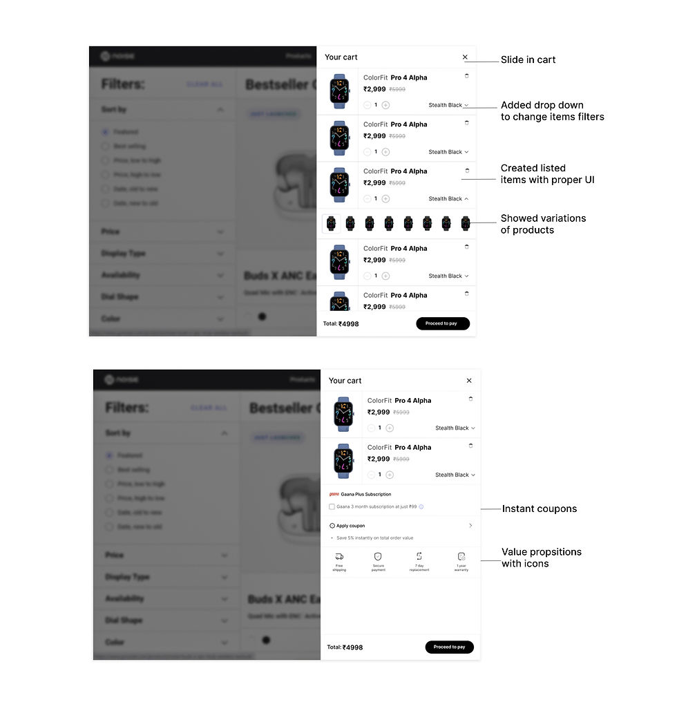
Key Features of the Pull-Up Drawer:
🔑 Seamless Access:
Quick View: The pull-up cart allows users to review their cart without leaving the current page, ensuring a smooth and uninterrupted shopping experience.
🔑 Enhanced Usability
Intuitive layout: The bag provides organised layout with clear options for updating quantities, removing product, and applying discount codes
Simplified Checkout: Users can directly proceed to checkout, thus reducing the steps.
🔑 Value added features
Apply coupon: Users can directly apply coupons within the cart making it simpler to access.
Subscribe to Gaana: Noise has collaboration with gaana music, and users can directly subscribe to improve experience and increase repeat engagement.
Gift giving option: One of the core values of Noise products( most people buy products for gifts) thus ease of use for the user with integrated gift wrapping options.
Removing products from cart: With simplified access to delete icon, a user can directly remove items.
Add out of stock products: Users can now add out of stock products to their carts and get notified when the product is in stock again thus improving sales.
🔑 Core brand value propositions:
Free shipping icon: Highlighting free shipping prominently to reassure users.
Secure payment: Assurance of security in paying for building trust
7 day replacement: Clear display to mitigate purchase hesitation.
1 wear warranty: Highlighting 1 year warranty to emphasise quality and support.
Simpliying the journey while conveying a stronger value
The main value users seeked was a simple and efficient shopping experience enriched with clear visibility of savings opportunities (through coupons and discounts), confidence in their purchase (via secure payment, easy replacement, and warranty assurances), and added functionalities (such as subscription benefits and gifting options) that enhance the overall value of their shopping journey.

Research
2. My Process
🧭 Discover
Understand the mindset, goals, behaviors, and pain points of the identified stakeholders in this space.
-
Understanding goals of business and users
-
Competitive analysis
-
UI Audit
👩🏻💻 Define
Defining the user pain point , journey and JTBD frameworks and empathising with them.
-
User Persona
-
Journey mapping
-
Empathising with User
📝 Develop
Ideating different solutions and creating flows and prototypes.
-
Ideation
-
User Flow
-
Prototype
🎯 Deliver
Identify the strengths and weaknesses of proposed concepts and iterate to the most desirable solution.
-
Visual design
-
Design components
-
Prototype
2.1 User Research
Learnings:
Problem assumptions:
I tried the application and website myself to discover the following problems
-
Cannot access the cart easily
-
Cannot cancel the products in the cart ( No notification )
-
No access to coupon code
-
Outdated UI
-
No back button for the user to go back
-
Cannot add items to the shopping cart incase product is out of stock
-
No notification of out of stock items get back in stock
User Flows: Users reach the product cart page through two flows:
-
Add to bag
-
Buy Now

Target users:
1. First time users ( but having knowledge of online shopping experience )
2. Existing users of Noise ( Loyal customer base)
User Interviews:
To validate the problems mentioned above, I conducted user interviews: talked to 12 users, including one on one interviews and over phone call, also collected some of their screen recordings of their buying journey on the noise app and website.
User Journey ( Main journey recorded ):
1. The user opens the Noise website and searches for the smartwatch.
2. The user opens the smartwatch page and applies filters.
3. The user then adds the smartwatch to their bag: clicking on buy now button.
4. The bag icon shows the product added.
5. However on opening the bag: it takes the user to another page that takes 2 mins to load.
6. User is confused to go back to the homepage.
Major Pain Point: Now the user is confused and frustrated and completely abandons the product page altogether and ends up not buying the product.
Some other User scenarios:
Some major user scenarios where a user uses the product bag feature:
👉 Put items in the product bag
Go to Noise > Find the item you are looking for > Add to bag
👉 Unable to add item to the cart
Go to Noise > Find the item you are looking for > Item out of stock > Can't add to bag
👉 Purchase items that have been added to the bag
Go to Noise > Open product bag > Purchase Product
👉 Delete items added to the bag
Go to Noise > Open product bag > Delete product
2.2 Insights
Here are some of the main takeaways I collected from user interviews. I divided them into major themes to understand pain points:

Main Findings
🛒Adding items to the bag:
Observation:
Adding items was generally straightforward, but some participants were confused on why they couldn't add out of stock items in the bag. They usually added the items to the bag to compare them and view discounts but could not do that as there were no options provided.
Insights:
Offering an option to add out-of-stock products to the wishlist and later notify the users when the products are back in stock would be beneficial. Instant access to cart as a step before checkout with options of checking items, comparing them, applying discounts, understanding shipping into etc was lost, hence a lack of transparency.
🛍 Reviewing the Bag:
Observation:
Participants disliked being taken to a new page just to review items in their bag.
Insights:
Implementing a new design to access the cart for faster, seamless review.
2.2 Competitor Analysis
I did a review of the competitor applications , direct competitors ( Boat, Firebolt , Bose , Fossil ) and indirect competitors ( Behance,dribble )to understand more about cart views , how different bags / carts operate, what are the different features added


2.3 UI AUDIT
I did a UI audit of the current screens to understand what was working and what was not.


Define problem
3. Empathising with the users
Some of the main gaps realised before empathising with the users were as follows:
3.1 Defining Target audience
Developing user personas
After conducting customer journey mapping and extensive research, it was discovered that there is a distinct target audiences for our service:. To gain a deeper understanding of these audiences, I created detailed personas .

3.2 Defining key challenges
Through mapping the journey :

Developing strategy
4. Ideating
4.1 Developing Design strategy
The first step towards starting the design was to set some goals and principles to validate my ideas. Here's where Noise Design principles are put into play. Just as with the design system , I aimed to adhere to Noise's design principles while crafting any experience.
The principles kept in mind:

Plan of action👉:
1. Decide the design of the bag and reasoning
2. Decide the features and visual design of the bag
Step 1:
Exploring How might we incentivise Noise users to reduce dropout from bag page, by providing quicker access and keeping the design simple yet efficient.

STEP 2:
Deciding on the features that need to be added to the bag
For this step, I devised strategies to tease benefits of shopping cart and Noise services. Collaborating with the content designer, product manager and senior designer, I developed compelling features for the cart and then rated them on the impact-priority scale to understand which ones to move forward with.
Features that solve the main problem based on their significance, urgency and impact were rated.
Here is a table view outlining the features for Noise product bag, including their purpose , impact and how they solve the main problem: preventing cart abandonment by providing a quicker, safer and efficient experience.

4.3 User Flow
This is the improved user flow after adding the selected features in the Noise bag, it helps the user understand the journey from start to finish including the actions user will take and the interactions between them.

4.4 Wireframes

Before the mockup creation , a simple visual layouting and a basic flow of the Noise product bag was created. I first sketched it and made a lot of iterations and then created high fidelity mockups , got them tested again and iterated before final screens. This functions as an itionial design, before final screens were created.

Developing the design system:
Before the prototyping phase, I used the following design system based on Noise design principles and existing systems and created components.

🚀 Final Screens
Building a pull up drawer and slide cart solution that not only helps in saving time, but provides better features for retention rates and boosting sales.
5.1 Main Features
1. Pull-up drawer

2. Slide cart
Testing
6. Validation criteria
Before giving away the screens for final developement, I did a quick heuristic analysis to ensure they are following Noise design principles and proper Ux laws.

Learnings
8. Reflecting on the lessons
-
Product Management : This project taught me how to take a product from research to concept to launch while adhering to technical, business, and design goals and restrictions. By combining active research and synthesis, I was able to generate a variety of deliverables that demonstrated the market viability of our special product.
-
User Experience: With the intention of providing an authentic, captivating, reliable, approachable, and unique experience to pique users' interests from the first interaction, I put extra effort to the design of the app's and website's interface through cooperative wireframing, prototyping, and iterating in response to input gathered from ongoing user research.
-
Compelling Storytelling: I improved my storytelling abilities as I pitched my product's idea at different project stages. I did this by using interactive presentations, visual aids, and persuasive speech to draw in our audience. I used anecdotal and statistical facts to convey a story that many people could relate to.